Kitchen cabinet colours that won't date
Why the 'right' colour keeps changing, and how to choose one that suits your light, your worktop and the way your kitchen gets used.
Updated 28 October 2026 · The Kitchen Resprayer
The short answer
No single colour stays in fashion. In Houzz's UK surveys grey was the most chosen cabinet colour in 2023 and 2024; by 2026, blue and green were ahead.
A colour stops looking dated when it suits the room: the light it gets, the worktop and floor you're keeping, and how much it will show wear.
One kitchen, four colours
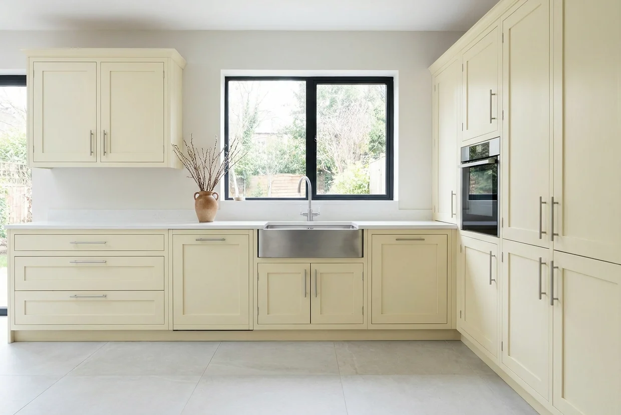
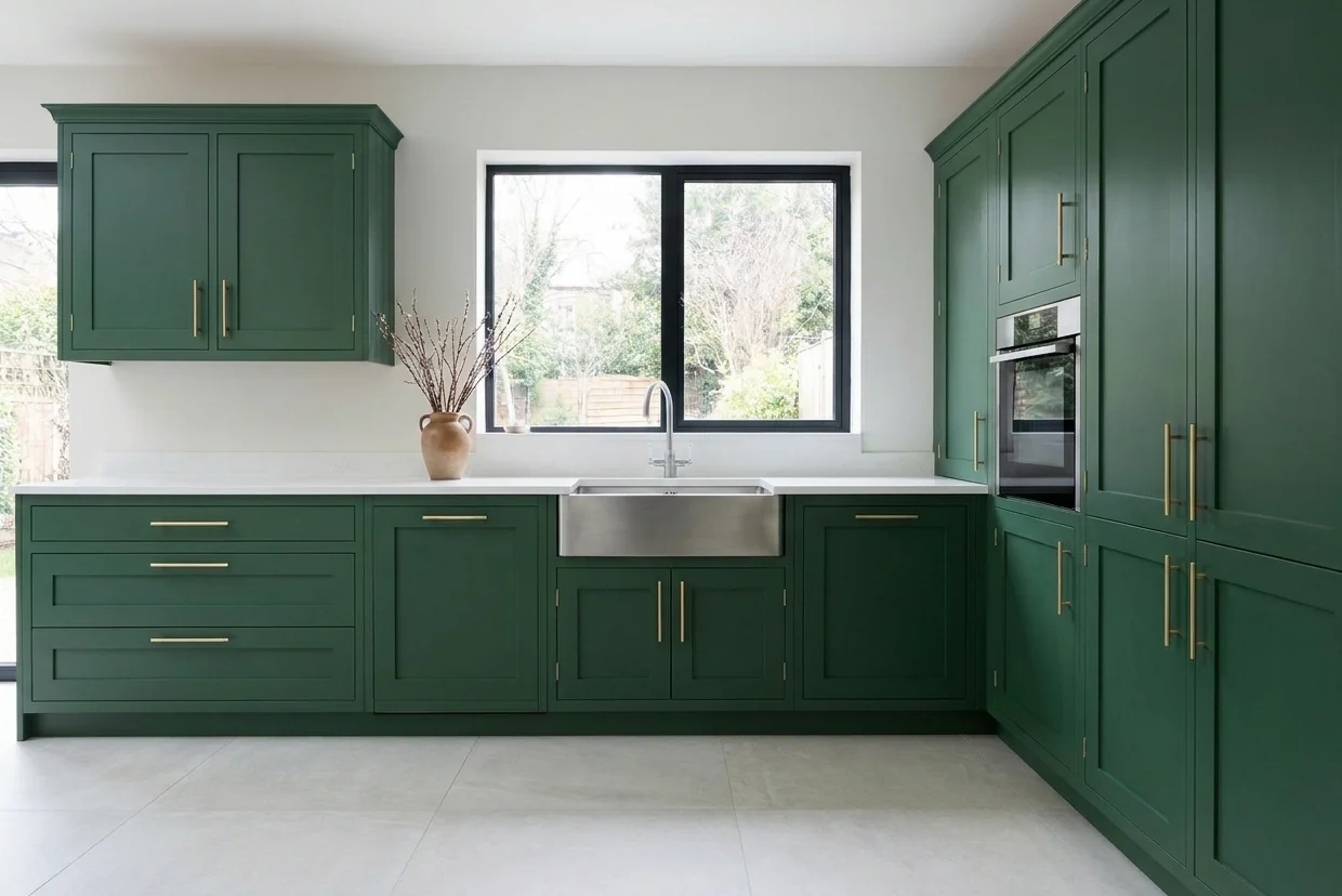
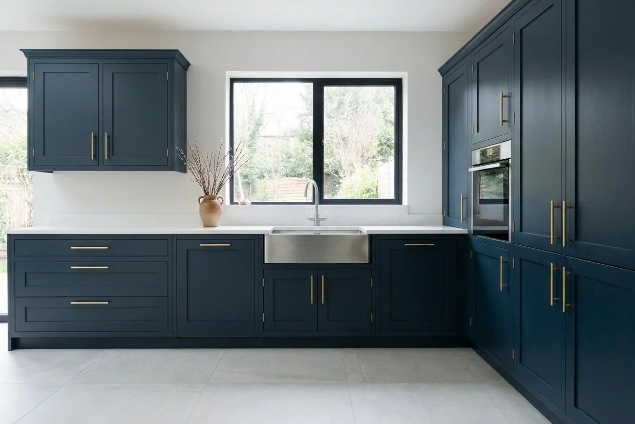
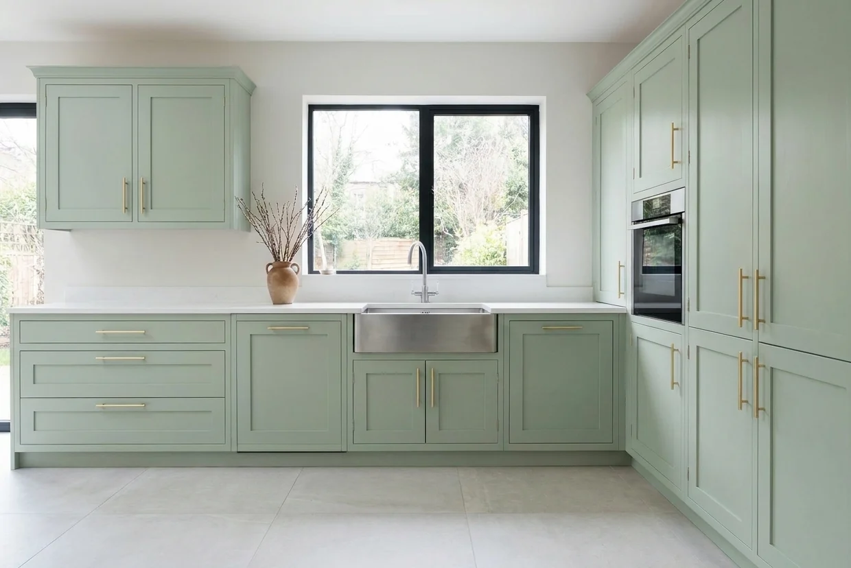
The same kitchen as it is, and in three of the colours people choose most. Notice how much the worktop, floor and window light change how each one reads.
What people actually choose
| Cabinet colour | Houzz UK 2023 | Houzz UK 2024 | Houzz UK 2026 |
|---|---|---|---|
| Grey | 21% | 19% | 12% |
| White | 19% | 15% | 8% |
| Blue | 17% | 17% | 18% |
| Green | 13% | 16% | 17% |
| Off-white | n/a | n/a | 9% |
| Wood | n/a | n/a | 9% |
| Beige | 7% | 8% | n/a |
| Black | 4% | 5% | n/a |
Houzz's surveys of its own UK users mid-renovation (1,085 in 2023, 497 in 2024, 402 in 2026). Houzz says its 2026 questions and answer choices changed, so read the columns side by side, not as a trend line.
The useful lesson is not which colour is winning. It's that the leader moves, so a colour chosen because it is popular this year is the one most likely to look like this year later.
Start with the light
North-facing
South-facing
East and west
After dark
LRV: the number that tells you how light it really is
LRV, light reflectance value, is how much light a colour reflects. Crown explains it simply: the more light a colour reflects, the lighter it is and the higher its LRV. Dark colours absorb more and reflect less.
You can often read it straight off a trade colour code. Crown says the middle two digits of its trade codes are the LRV, so a colour coded C7832S has an LRV of 83 and B8080A an LRV of 8. Dulux Trade codes run hue, then LRV from 00 to 99, then chroma.
Use it to compare the colours on your shortlist from the same maker. A low-LRV colour in a north-facing or small kitchen will look darker on the doors than it does on the chart; a high one bounces light round the room. Different makers' figures aren't guaranteed to compare, so check each maker's own number.
Choose by your kitchen
| Your kitchen | What tends to work |
|---|---|
| North-facing | Warm neutrals, or a deliberately deep colour; avoid pale blue- or grey-based shades |
| South-facing | Most colours, including cooler greens and blues |
| Small or low on light | Cabinets the same colour as the walls, and a higher LRV |
| Wood worktop or wood floor | Greens, and muted blue-greys, which Farrow & Ball pairs with timber |
| White worktop | Compare whites together: undertones that look identical alone can clash side by side |
| You want a bold colour | Put it on the island or the lower units, with calmer uppers |
From Dulux UK, Farrow & Ball, Crown and a UK kitchen retailer, listed at the foot of this page.
Houzz's UK figures show what most people are matching to: white was the most common worktop in its 2024 survey (48%), and wood the most common floor in 2026 (43%).
Undertones next to your worktop and floor
Farrow & Ball says neutrals come with blue, yellow, red and even lilac undertones, and that a blue-grey cast shows more in bright light. That's why a white that looks right on its own can look grubby next to a white worktop.
One UK kitchen retailer suggests taking samples home and looking at them beside the floor you're keeping, at several times of day. Farrow & Ball also notes that a plain wooden worktop steps back and lets the cabinet colour lead.
Two colours
In Houzz's 2026 survey, 29% chose different colours for upper and lower cabinets. The lower units were most often green, grey or blue; the uppers most often wood, off-white or beige.
Harvey Jones suggests a bolder shade on a focal point such as an island or pantry, with the main run kept more neutral. A UK kitchen retailer says give the two colours a clear link, such as a shared undertone, timber or handle finish. A second colour usually adds to the cost of a respray: see what a kitchen respray costs.
How much your colour will show wear
Chips
Marks
Whites turning yellow
Going lighter
If you're selling soon
Which? advises more neutral colours for the permanent parts of a kitchen if you want the biggest lift in value, and timeless schemes over current trends, because some buyers want a blank canvas.
Test it properly before you commit
Paint big samples
Put them where the doors are
Live with them
Match the sheen
Where this comes from
- Houzz UK Kitchen Trends Study 2023
- Houzz UK Kitchen Trends Study 2024
- Houzz UK Kitchen Trends Study 2026
- Farrow & Ball, how light affects colour
- Farrow & Ball, how to sample
- Farrow & Ball, painting kitchen cabinets (25 September 2025)
- Farrow & Ball, painting furniture (25 September 2025)
- Farrow & Ball, neutral kitchens
- Farrow & Ball, green colour schemes
- Farrow & Ball, blue colour schemes
- Dulux, decorating north and south facing rooms
- Dulux, how lighting affects colours
- Dulux, getting colour confident
- Crown Paints, Commercial Colour Book (LRV)
- Dulux Trade colour notation
- Harvey Jones, kitchen colour ideas (28 May 2025)
- Create German Kitchens, timeless kitchen colours
- Which?, what people regret about their kitchens (27 April 2026)
- Which?, does a kitchen renovation add value (23 January 2026)
- Which?, how to paint kitchen cabinets (27 April 2026)
- Solvent-based satinwood data sheet (Dulux Trade, issued August 2025)
- Shellac primer data sheet (tinting)
- Mumsnet, painted kitchen: does it chip?
- Houzz UK forum, timeless kitchen cabinet colours
All read 28 October 2026. Firms change their prices and terms; check the current position with them.
Common questions
No colour is immune: in Houzz's UK surveys the most chosen cabinet colour changed between 2023 and 2026. Which? advises timeless colour schemes over current trends for anything permanent. In practice a colour lasts when it suits the room's light and the worktop and floor you are keeping.
In Houzz's 2026 survey of its UK users, blue (18%) and green (17%) were the most chosen cabinet colours, ahead of grey (12%). In its 2023 and 2024 surveys grey was first. Houzz says the 2026 questions changed, so the years are not a like-for-like comparison.
Dulux says north-facing rooms get cooler light and less of it, and suit warmer shades: warm neutrals help a north-facing kitchen avoid feeling gloomy. Farrow & Ball says avoid pale colours with a blue or grey base there, or accept the cool light and go deliberately dark.
Farrow & Ball suggests painting the cabinets the same colour as the walls in a smaller room, so the space feels less cluttered and larger. Check the colour's LRV too: a higher number reflects more light.
They can. One homeowner describes white primer glaring through chips on a dark kitchen. A primer close to the final colour makes a chip far less obvious, which is why one primer maker suggests tinting the primer towards the topcoat.
29% of the Houzz UK users surveyed in 2026 chose different colours for upper and lower cabinets, usually a green, grey or blue below and wood, off-white or beige above. Give the two colours something in common, such as an undertone or the handles. A second colour usually costs extra on a respray.
Rather have it sprayed for you?
Send two photos of your kitchen and we'll price the respray from them. The quote costs you nothing.
Get my free photo quote